Tri-Synergy

To celebrate a decade in business for Tri-Synergy Marketing unveiled a new website and stylish new branding.
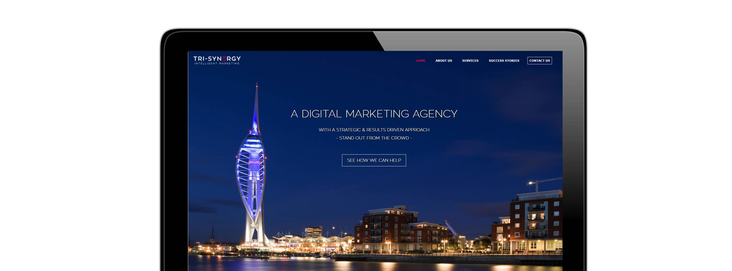
In line with website development, Tri-Synergy's new responsive website is also on trend with its use of large banners, more visuals and concise content.
To ensure that all of Tri-Synergy's marketing communications are consistent, the innovative overhaul of the website not only features a fresh new look but it mirrors the company's new branding.
In addition to the aesthetic changes, the launch of Tri-Synergy's new website provided the perfect opportunity to hone our messaging, to push the key services we offer and to optimise the site from an SEO perspective.
Visitors to Tri-Synergy's engaging new site now experience an easy to navigate menu structure as well as clean and bright visuals.
The home page features the company's key services in a prime position which are easily accessible via related pages.
Professional photography throughout gives the site a fresh and contemporary look, bolsters the strong new branding and helps draw attention to client success stories.
“We are delighted with our recent rebrand and launch of our new website. Our website is a crucial marketing tool for Tri-Synergy and the recent revamp has enabled us to design and build a modern looking website whilst offering practical functionality, which allows our visitors to find our key services quickly.
The use of vivid imagery and large banners throughout the website has brought a new lease of life to our website, and really brings our case studies alive.
Celebrating 10 years in business is an incredible milestone and we feel the new branding perfectly reflects the journey we have made and where we now sit within the Digital Marketing industry.”

